

Elementor Site Settings
Elementor Site Settings allow you to configure global design settings that apply across your entire website. These settings control colors, typography, buttons, forms, layout, and more.
Accessing Site Settings
To access Elementor Site Settings:
- Edit any page or template with Elementor
- In the Elementor editor, click the hamburger menu (☰) in the top-left corner
- Select Site Settings from the menu
- The Site Settings panel will open on the left side
Site Identity
Configure your site's branding and identity elements.
Site Logo
- Expand the Site Identity section
- Click Choose Image next to Site Logo
- Select a logo from your media library or upload a new one
- Adjust the logo size using the Max Width slider (recommended: 200-300px)
Site Icon (Favicon)
- In the Site Identity section, find Site Icon
- Click Choose Image to upload your favicon
- Recommended size: 512×512px (WordPress will automatically resize it)
- The favicon appears in browser tabs and bookmarks
Site Title & Tagline
- Site Title: Your website's name (used in SEO and browser titles)
- Tagline: A brief description of your site (appears in search results)
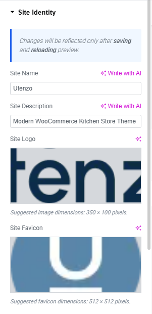
These settings override the default WordPress Site Title and Tagline from Settings → General.
Global Colors
Define your site's color palette that will be used throughout all pages and templates.
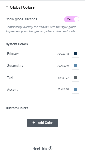
Primary Color
The main brand color used for primary buttons, heading colors, text highlights, and accent elements.
Secondary Color
Used for secondary buttons, badges and labels, subtle UI accents, and supporting elements.
Text Color
The default text color for body content. Ensure sufficient contrast with the background for readability.
Accent Color
An additional accent color for special highlights, notifications, or emphasis elements.
Use a color contrast checker to ensure your text colors meet WCAG accessibility standards (minimum 4.5:1 for normal text, 3:1 for large text).
Typography
Configure global typography settings that apply site-wide. The Typography section is divided into two main parts: Global Fonts for managing font families and Theme Style Typography for styling specific text elements.
Global Fonts
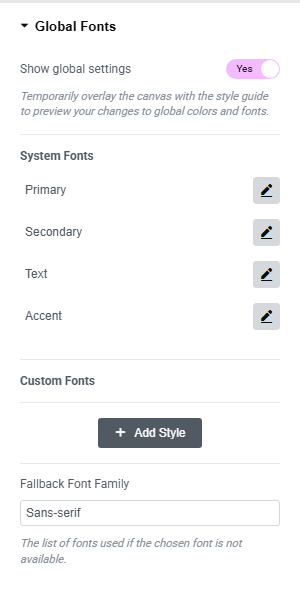
The Global Fonts section allows you to define font families that can be used throughout your site.
Show Global Settings
Enable the Show global settings toggle to temporarily overlay the canvas with the style guide. This allows you to preview your changes to global colors and fonts in real-time while editing.
System Fonts
Define four system font categories:
- Primary: Main font family for primary headings and important text
- Secondary: Secondary font family for subheadings and supporting text
- Text: Font family for body text and paragraphs
- Accent: Font family for accent elements and special highlights
Use Swap display mode in font settings to prevent invisible text during font loading. This ensures users see text immediately, even if the custom font hasn't loaded yet.
Theme Style Typography
Configure typography styles for specific text elements including body text, links, and headings.
Body
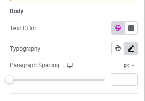
Configure default body text styling:
- Text Color: Set default text color for body content
- Typography: Configure font family, size, weight, and line height
- Paragraph Spacing: Control spacing between paragraphs
Link
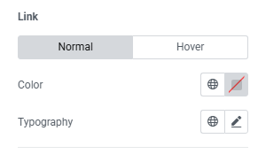
Style links for normal and hover states:
- Normal State: Set default link color and typography
- Hover State: Set link color and typography on hover
Headings (H1-H6)
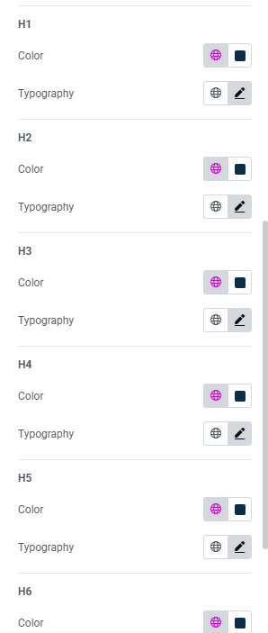
Customize typography for each heading level:
- H1: Configure color, font family, size, weight, and line height for the largest heading level (typically used for page titles and main headings)
- H2: Set typography styles for secondary headings (commonly used for section titles and major content divisions)
- H3: Define styling for tertiary headings (often used for subsection titles and content organization)
- H4: Configure fourth-level heading styles (typically used for smaller section breaks and content grouping)
- H5: Set typography for fifth-level headings (used for minor headings and detailed content organization)
- H6: Define styling for the smallest heading level (used for fine-grained content structure and emphasis)
Maintain a clear hierarchy by making H1 the largest and progressively smaller sizes for H2-H6. This creates visual consistency and improves content readability across your site.
Buttons
Define default button styles that will be used across your site. Configure both Normal and Hover states for consistent button styling throughout your website.
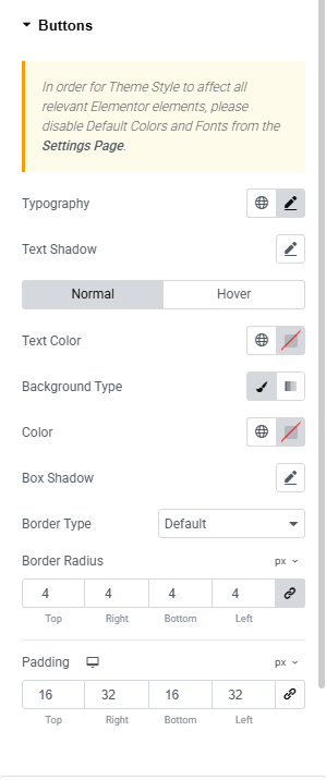
Configure default button styles for your entire site:
Normal State
- Text Color: Set the default button text color
- Typography: Configure font family, size, weight, and style
- Background: Set button background color or gradient
- Border: Define border width, style, and color
- Border Radius: Control button corner roundness
- Box Shadow: Add shadow effects for depth
- Text Shadow: Apply shadow to button text
Button styles defined here become the default for all Button widgets throughout your site. You can still override these settings on individual buttons when editing pages.
Layout
Configure global layout and container settings for your site.
Layout Settings
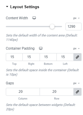
Content Width
Set the maximum width of content containers:
- Content Width: Default 1140px
- Units: px, em, rem, %
Container Padding
Set spacing inside containers:
- Container Padding: Default 10px for all sides
- Configure Top, Right, Bottom, Left padding individually
- Use chain-link icon to link/unlink values
Gaps
Set spacing between widgets:
- Column Gap: Horizontal spacing (default: 20px)
- Row Gap: Vertical spacing (default: 20px)
- Units: px, em, rem, %
Breakpoints
Configure responsive breakpoints for different screen sizes. Breakpoints define when your layout adapts to different device sizes.
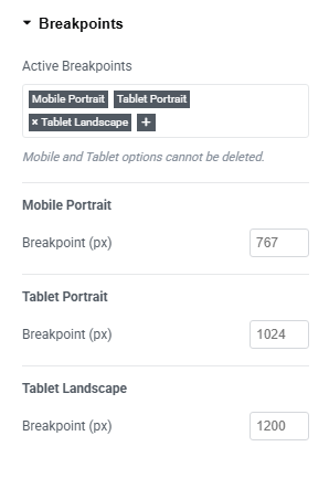
Active Breakpoints
Manage your responsive breakpoints:
- Active Breakpoints: Default includes Mobile Portrait (767px) and Tablet Portrait (1024px)
- Additional Breakpoints: Tablet Landscape (1200px) and Laptop (1366px) - can be removed
- Use + button to add custom breakpoints
- Mobile and Tablet options cannot be deleted
Breakpoints determine when your responsive design switches layouts. Adjust based on your target audience's devices.
Custom CSS
Add custom CSS that applies site-wide. Perfect for overriding theme styles or adding global customizations.
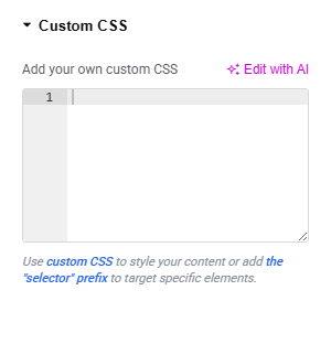
- Expand the Custom CSS section
- Enter your CSS code
- Click Update to save
Custom CSS applies globally. Use specific selectors and test thoroughly to avoid breaking other elements.
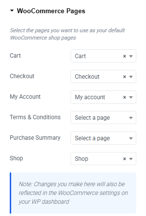
WooCommerce
Configure WooCommerce pages for your online store.
Select pages for each WooCommerce function:
- Cart: Shopping cart page
- Checkout: Payment and order completion
- My Account: Customer dashboard for orders and profile
- Terms & Conditions: Legal terms page
- Purchase Summary: Order confirmation page (optional)
- Shop: Main product catalog