

Product Layout
Configure how product images and information are displayed on single product pages. These settings control the visual layout and organization of product content.
These settings are configured individually for each product in the product edit page. Go to Products → All Products, edit a product, and navigate to the Advanced tab to configure the layout settings.
Settings Panel:

Product Layout
Choose how product images are displayed on single product pages. The layout determines the arrangement of the main product image and thumbnails.
Available Layout Options:
- Bottom Thumbnail: Thumbnails displayed below the main product image
- Left Thumbnail: Thumbnails displayed on the left side of the main product image
- Right Thumbnail: Thumbnails displayed on the right side of the main product image
- Gallery 1 Column: Single column gallery layout
- Gallery 2 Columns: Two column gallery layout
- Gallery 3 Columns: Three column gallery layout
- Gallery 4 Columns: Four column gallery layout
- Gallery Grid Fullwidth: Full-width grid gallery layout
- Gallery Stacked: Stacked vertical gallery layout
- Gallery Slider Container: Slider gallery within container
- Gallery Slider Fullwidth: Full-width slider gallery
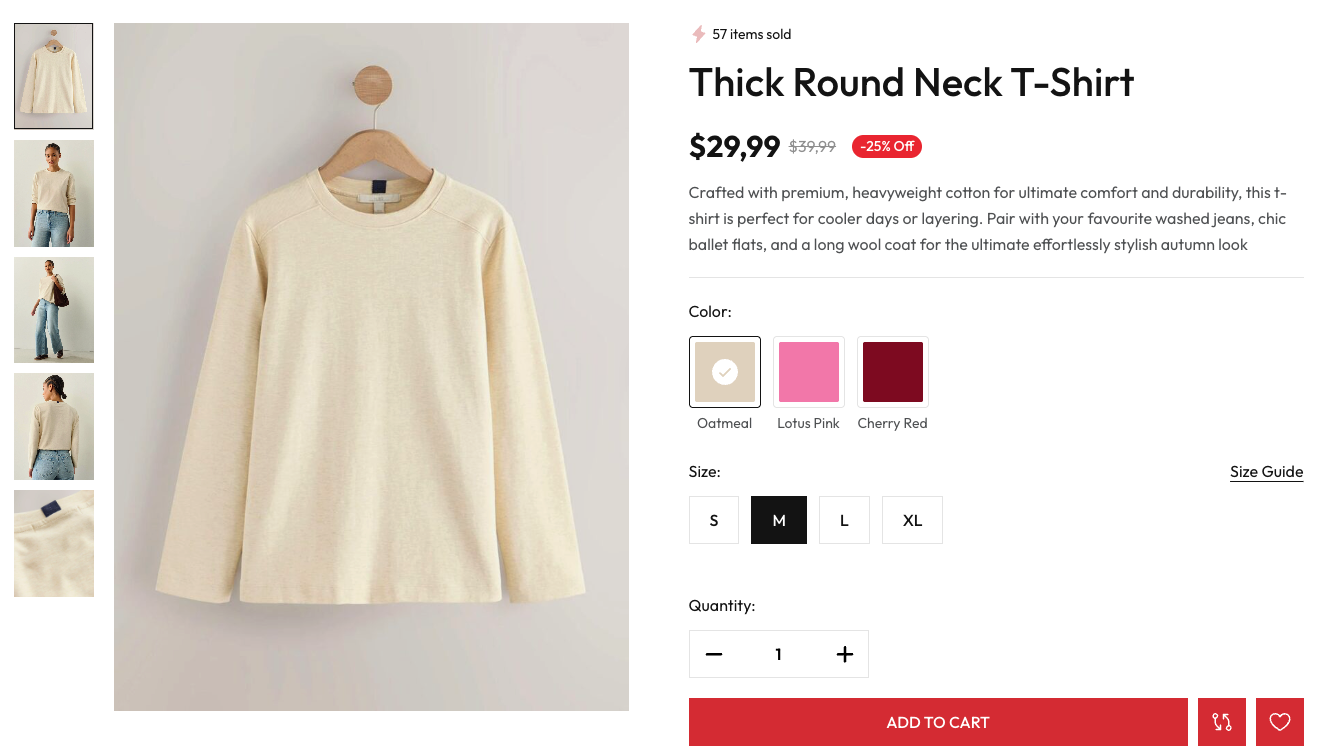
Frontend Example - Left Thumbnail Layout:
When using the "Left Thumbnail" layout, product thumbnails appear in a vertical column on the left side of the main product image, allowing customers to easily browse through different product views.
Product Info Display
Control how product information (description, specifications, reviews, etc.) is displayed on single product pages.
Available Options:
- Tab: Display product information in tabs (default)
- Toggle: Display product information in collapsible toggle sections
- Disable: Hide product information sections
Tab Display
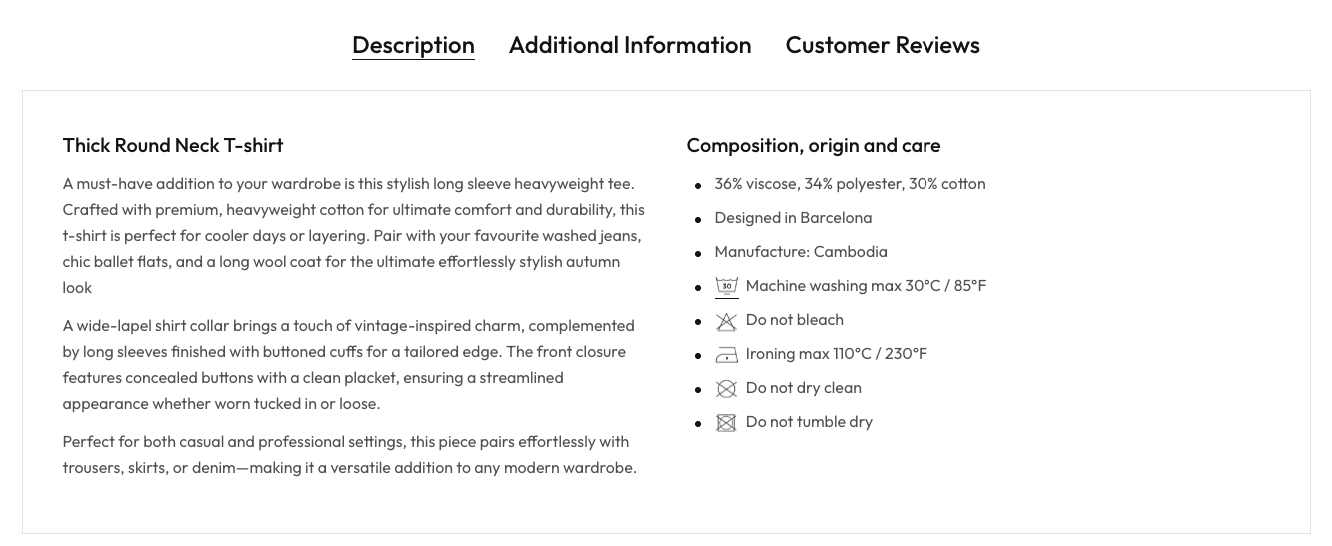
When set to "Tab", product information is organized into tabs such as Description, Additional Information, and Customer Reviews. Customers can click between tabs to view different sections.
Frontend Example - Tab Display:
Toggle Display
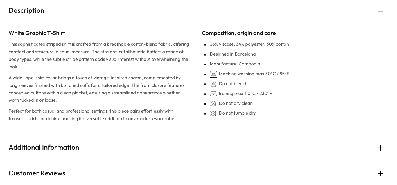
When set to "Toggle", product information sections are displayed as collapsible sections. Customers can expand or collapse each section by clicking on it, providing a cleaner and more organized view.
Frontend Example - Toggle Display: